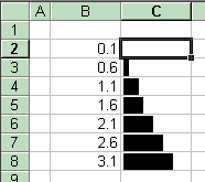
Microsoft has just announced a cool new feature on the Excel 12 blog: the databar. I think a picture (linked from Microsoft's Excel 12 Blog can explain it better than I can:

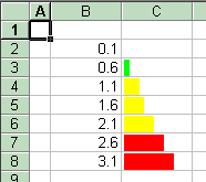
This will be a nice way to look for trends/outliers, but I can also see it being useful for tracking parallel completion percentages in status reports, etc. Of the Excel 12 features announced so far, this is the one that I'm the most excited about. Of course, it's also the one that's easiest to approximate in Excel <12. Andrew has an approach using Autoshapes on his blog, and I'm going to present a slightly different approach.
IMO, his approach looks a lot better, this approach has the benefit of updating automatically. Pick your poison. It all centers around this little UDF:
Option Explicit

Function GraphBar(x As Double, _
                  Low As Double, _
                  High As Double, _
                  ScaleTo As Double) As String

    x = ((x - Low) / (High - Low)) * ScaleTo

    Dim i As Integer

    Dim blockFull As String
    Dim blockHalf As String

    blockFull = ChrW(9608)
    blockHalf = ChrW(9612)

    GraphBar = ""

    For i = 1 To Fix(x)
        GraphBar = GraphBar + blockFull
    Next

    If x - Fix(x) > 0.5 Then
        GraphBar = GraphBar + blockHalf
    End If
End Function
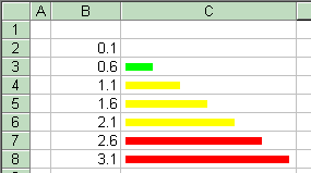
This isn't rocket science: all it does is rescale x from the range [Low, High] to the range [0.0, ScaleTo]. Then, it strings together that many Chrw(9608)'s, followed by a Chrw(9612), if the scaled value's fractional part is >0.5. The trick in this is that Chrw(9608) and Chrw(9612) are VBA expressions that produce the the Unicode equivalent of the old line drawing characters IBM put in the original PC [1]. 9608 is a full box ("█"), 9612 is a half box on the left ("▌"). The result of this function ends up being a string that (when displayed as Arial) looks like a horizontal bar. ("████▌"). Put a few of those in adjacent cells, and you get this:
The formulat in C2 (and filled down) is =GraphBar(B2,MIN(B$2:B$8),MAX(B$2:B$8),5). The MIN and MAX set the scale, the 5 sets the maximum length of a bar. The maximum length, font size, column width can be tweaked to produce a reasonably attractive result, although I do reccomend using vertical centering.
If you want to get a little fancier, conditional formatting works on plot cells...
...whitespace can possibly improve the appearance...
...and this technique can scale.
1] (The original PC didn't have standard graphics, it was an option. If you bought the monochrome, non-graphics, video board, characters like this were as close as you could get to a bar chart.)